Dubai's Leading Digital Marketing Agency
Get design flexibility and smooth functionality with websites tailored to work flawlessly on all modern platforms.
Platforms we have Expertise on


The way people browse the internet has changed and your website must adapt accordingly. As mobile usage continues to dominate, having a responsive website is essential to offering a unified, seamless experience. As a responsive web development company, we create websites that automatically adjust to every screen size, ensuring clarity, speed, and usability on all devices.
Your audience expects smooth navigation, readable layouts, and quick access to information whether they browse on mobile, tablet, or desktop. Our responsive design approach focuses on fluid grids, flexible visuals, and intelligently structured content that adapts without breaking the visual flow. This leads to better engagement and significantly improved user satisfaction.
Our responsive web development services also help your website load faster, which plays a major role in search visibility and customer retention. A website that performs consistently across devices keeps users on your page longer and guides them naturally toward action.
Whether you’re upgrading an existing site or building one from scratch, we help you stay future-ready. With our expertise, your website becomes an accessible, mobile-friendly digital asset that supports growth and reflects your brand’s professionalism everywhere.
Our responsive web development services help you deliver a seamless experience across all screens. From mobile-friendly layouts to adaptive ecommerce pages, we ensure your website performs consistently and keeps users engaged everywhere.
We build responsive websites that adjust effortlessly to every device. Our layouts prioritise clarity, loading speed, and easy navigation, ensuring your audience enjoys a smooth, consistent experience anywhere they browse.
Our UI/UX design approach focuses on intuitive interactions across mobiles, tablets, and desktops. We optimise every design element to improve usability, reduce friction, and deliver a visually consistent experience on all screens.
We build responsive ecommerce websites that help customers shop comfortably on any device. Product pages, menus, and checkout flows are designed to be fast, clean, and conversion-friendly, supporting better sales across platforms.
Our mobile-optimised design ensures your website loads quickly, works smoothly, and displays perfectly on all smartphones. We refine layouts, images, and navigation to deliver a friction-free mobile user experience.
We integrate SEO best practices into every responsive design. From fast loading times to clean architecture, our approach helps search engines understand your site better, boosting visibility and user engagement.
Upgrade your website’s usability with responsive design that adapts naturally to all screens and devices.
Our responsive web design solutions are supported by platforms and technologies built for speed, flexibility, and multi-device compatibility. As a responsive web design company, we work with WordPress, Shopify, Magento, and modern frontend frameworks to create layouts that adapt effortlessly to any screen. Each platform allows us to build mobile-friendly interfaces, cleaner navigation, and responsive ecommerce journeys that improve user engagement. With strong responsive web development services, we optimise performance through lightweight coding, fluid grids, and device-ready UI components. Whether your audience browses on mobile, tablet, or desktop, the platforms we use ensure your website delivers a consistent visual experience. Every implementation is focused on speed, usability, and long-term scalability.
Our responsive web design process ensures your website adapts smoothly to every device. From strategy and UX planning to development and optimisation, each step is crafted to deliver consistent performance and an engaging user experience.
Our process begins with understanding your brand, goals, audience, and the devices your users rely on most. As a responsive web design company, we analyse how customers browse your website across mobile, tablet, and desktop to create a responsive strategy that supports smooth engagement everywhere. This stage includes reviewing your current website (if available), identifying performance gaps, defining essential features, and outlining expectations for design and responsiveness. We also develop a device-specific behaviour map to ensure layouts, menus, and interactions feel intuitive across all screen sizes. Clear planning ensures your future responsive website has the right foundation, structure, and purpose before any design work begins.
In this stage, we create the blueprint for your responsive website’s structure and user journey. Our team develops wireframes that define how users will navigate, what paths they will follow, and how each screen will adapt responsively. As part of our responsive web development services, we focus on clarity, simplicity, and behaviour patterns that work across devices. We refine menu structures, content placement, visual hierarchy, and interaction flow to minimise friction and guide users smoothly toward their goals, whether browsing products, submitting a form, or reading information. By planning the UX framework early, we create a user-first structure that supports engagement and long-term performance.
This phase brings your website’s visual identity to life. Our designers create mobile friendly website design interfaces that automatically adjust to different screens without losing aesthetics or functionality. Every layout, button, image, and visual component is designed with responsiveness in mind. As a trusted responsive web design company, we ensure your website maintains brand consistency while delivering smooth usability on all devices. We focus on touch-friendly elements for mobile, flexible grids for tablets, and clean spacing for desktops. The goal is to craft an interface that feels natural and visually impressive, encouraging users to stay longer and interact with your content.
Once the design is approved, our developers transform it into a fully functional responsive website using clean, lightweight, and performance-focused code. We implement adaptive behaviours, ensuring your website adjusts fluidly to different resolutions, orientations, and browser environments. With strong responsive website development services, we integrate required tools such as forms, CMS features, ecommerce functionalities, APIs, and third-party systems. During this stage, we optimise speed, responsiveness, and accessibility, making sure your website functions equally well on fast networks, slower devices, and varying screen types. Our goal is to build a flexible, stable, and scalable website ready for real-world use.
Before your website goes live, we conduct comprehensive testing across multiple devices, browsers, and screen sizes to ensure flawless behaviour. This includes mobile phones, tablets, laptops, high-resolution desktops, and different operating systems. As part of our responsive web development services, we inspect loading speed, responsiveness, image optimisation, interactive elements, navigation flow, and overall user experience. Every component is validated for clarity, touch interactions, readability, and performance. We fix inconsistencies, refine responsiveness, and ensure the website maintains visual accuracy across all devices. Rigorous testing guarantees that users experience a smooth, consistent, and reliable website, no matter how or where they access it.
Once everything is finalised, your responsive website is deployed on a secure, stable hosting environment. Our team manages the technical setup, including DNS configuration, SSL activation, tracking scripts, and performance monitoring tools. After launch, we continue optimising loading speed, device compatibility, and SEO performance to ensure long-term stability. As an experienced responsive website development company, we provide ongoing support, updates, and improvements to keep your website aligned with evolving devices and user expectations. This continuous optimisation ensures your website remains modern, fast, and competitive, delivering the best possible experience across all screens.
Choosing the right responsive web design company ensures your website performs consistently across devices. Our expertise combines smart UX, mobile-first design, and high-performance development to deliver responsive experiences that improve engagement, retention, and conversions.
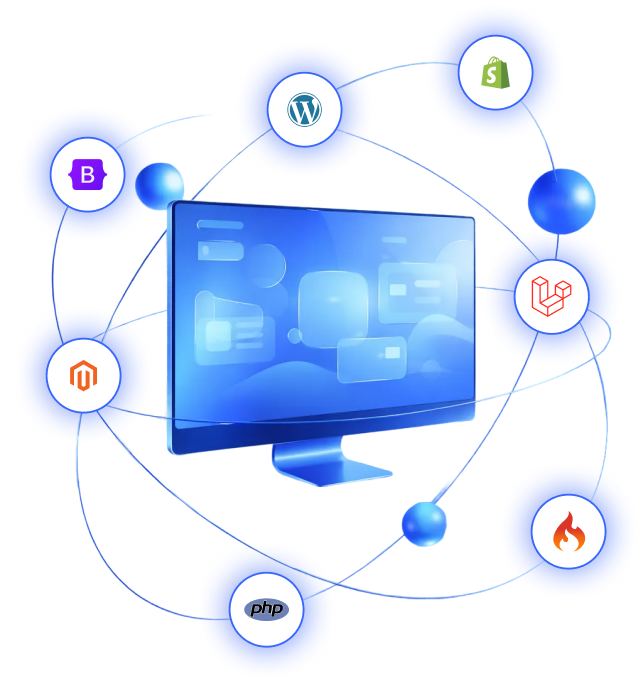
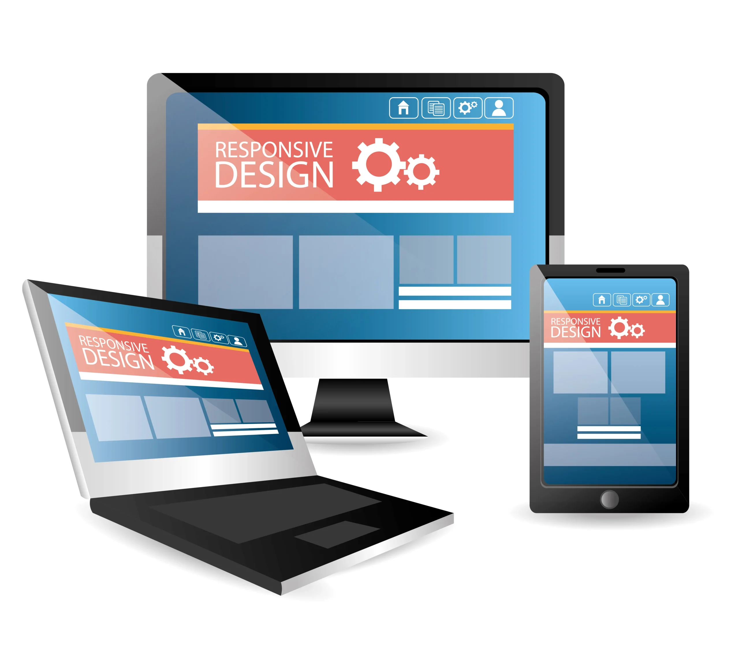
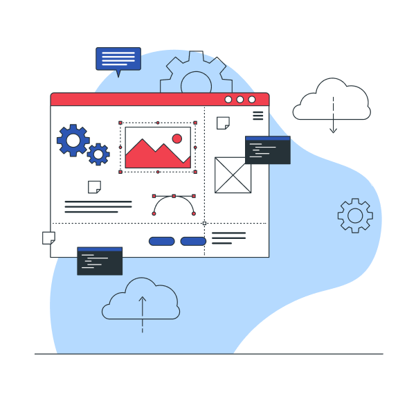
With years of experience designing for mobiles, tablets, and desktops, we understand how real users interact across devices. This expertise allows us to create responsive websites that maintain quality, clarity, and performance everywhere.
We design for mobile before scaling to larger screens. This ensures faster loading, cleaner layouts, and better interactions on the devices your customers use most, leading to stronger performance and higher engagement across platforms.
Your project is handled by a team of certified UI/UX designers and full-stack developers well-versed in responsive frameworks and modern coding standards. This ensures your website is visually strong, technically sound, and future-ready.
Responsive websites require efficient code to load quickly on any device. Our responsive web design services use lightweight builds and performance optimisation techniques to ensure your site remains fast, stable, and reliable.
Every website undergoes detailed testing across mobiles, tablets, desktops, and major browsers. We evaluate performance, readability, touch interactions, and alignment to ensure visitors experience the same quality everywhere.
Beyond designing responsive layouts, we support you with continuous updates, refinements, and improvements. As your responsive web development company, we help your website evolve with devices, browsers, and user behaviour trends.
Give your users a seamless experience on every device with a fully responsive, mobile friendly website design


I searched on Google for “SEO companies in India” & their name was on top 10 results. This made me believe that they can handle our SEO. My experience till now has been really good.
Varsha Bansal
Vivaan Solar

I have redesigned my website by SAVIT Interactive. They have done fantastic job. All my customers are really happy with it, I’m getting lots of work from it.
Jim Bridgen
Founder, Northern Beaches

They have done the job really professionally. The way they approached to develop the Website & the structured way they sent us the questionnaires to understand our business requirements was really good.
Prakash Rathod
Founder, Ganesh Precision

We are happy to be ranked #1 on Google for our multiple keywords which we have been working on with SAVIT & I really liked the team’s professionalism & work ethics.
Krishna Teja
Cupidcare

They have an innovative sort of interactive approach. Most of our keywords are in top 10 of the Google Search and also we have achieved massive results in terms of organic traffic.
Sunny Karety
Founder, Concordant One Tech

Sachet Mahajan
Founder, Zero-G Beds

Harsh Shah
Founder, Sarvarth

Savit Interactive Services is an organization of highly effective and professional go-getters, who can help you immensely in digital marketing, SEO, SMO and Web Design elements of your businesses. We have used them for these services for our organization and were always delighted by the output.
Dr. Karna Upadhyay
All India Dean, NIEM

Roger Farrell
Founder, Impact LED Screens

Mihir Vaze
Chief Design Officer, Elcom

Harsh Jain
Founder, Karefoam

Nisha Sharma
It's Concepts
Contact us today to grow your business online!
Responsive website development services ensure your site adjusts to different screen sizes without breaking layout or usability. This includes flexible grids, device-friendly menus, speed optimisation, and smooth touch interaction.
Yes, our responsive web development services in Dubai include ecommerce. We optimise product pages, checkout flows, and navigation to ensure the store delivers a friction-free shopping experience on mobile and desktop.
A responsive web development company optimises layouts, images, content flow, and code so your website loads faster and functions consistently on every device. This improves user experience and supports stronger search rankings.
Yes. We can build a responsive website tailored to your brand, audience, and goals. Our process covers UX, UI, coding, testing, and optimisation to ensure your site works smoothly on mobiles, tablets, and desktops.
Yes. As a responsive website development company, we audit your current site, identify issues, and rebuild layouts to ensure compatibility with all major devices, browsers, and screen sizes.
As a top responsive web design company in Dubai, we focus on mobile-first layouts, fast loading, and clean UX. Our team ensures your website adapts smoothly across all devices while maintaining high performance and visual quality.
Timelines vary based on the complexity of your site. However, most responsive redesigns take 2–6 weeks. Our responsive web development services follow a structured workflow to deliver high-quality results quickly.
Yes, positively. Google prioritises mobile-friendly sites. With professional responsive website development services, your website becomes faster, more user-friendly, and better structured, improving search visibility.
Absolutely. We maintain your colours, style, and brand identity while delivering mobile friendly website design that loads quickly and adapts perfectly to smaller screens.
Yes. Our responsive website development services include testing on older devices, various browsers, and different resolutions to ensure compatibility and smooth performance for all users.
Tell us your challenges, and we’ll guide you with the right responsive fixes.
No posts found!